Website design
2 weeks
Challenges
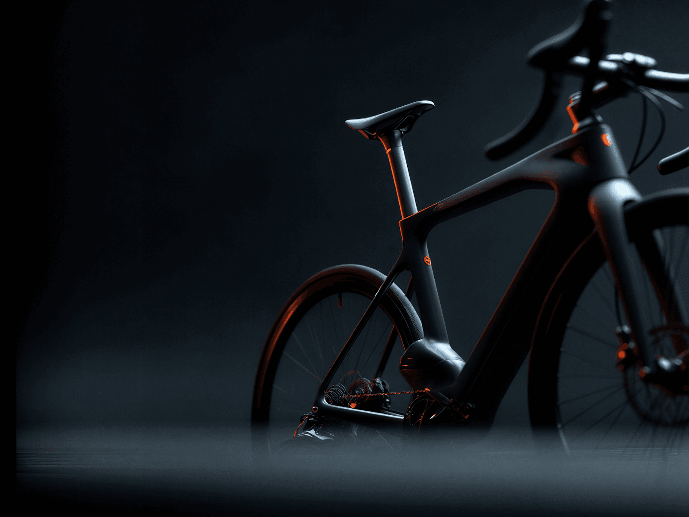
The main challenge was to create a bicycle brand that feels modern and design-driven without losing its everyday practicality. The market is saturated with performance-focused or overly technical cycling brands, leaving little room for a more lifestyle-oriented approach. The brand needed a clear identity that communicates movement, freedom, and urban culture while remaining approachable to a wide audience. Another challenge was ensuring the visual identity could scale across physical products, digital platforms, and brand touchpoints without losing clarity or character.

Solution
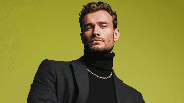
A clean and minimal brand identity was developed with a strong focus on motion and simplicity. The visual language uses bold typography, subtle graphic elements, and a restrained color palette to reflect movement and modern urban life. The concept was designed to work seamlessly across bicycles, accessories, digital content, and marketing materials, creating a cohesive and recognizable brand presence. By combining functional design with a strong conceptual foundation, the brand positions itself as both practical and expressive — a bicycle brand made for everyday movement.